
California • Est. 2019
Premium mushroom chocolate bars, gummies, and cones crafted in California. Bold flavors, uncompromising quality, and a brand built from the ground up.
Explore the CollectionOur Collection
Shruumz Chocolates & Gummies
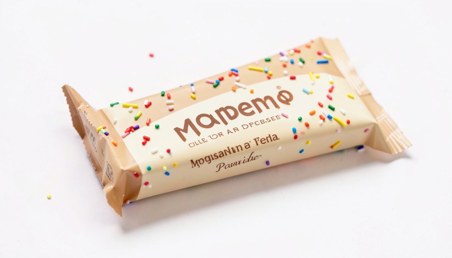
Birthday Cake
Celebratory flavor with a sweet, cake-inspired profile. Available in 1-pack and 10-pack.
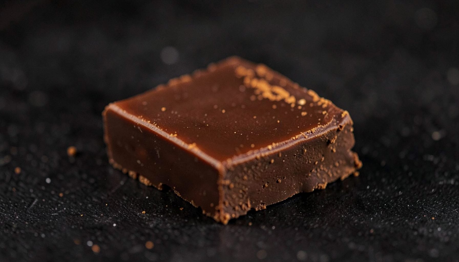
Cinnamon
Warm spiced chocolate with a smooth finish. Single bars and bulk packs available.
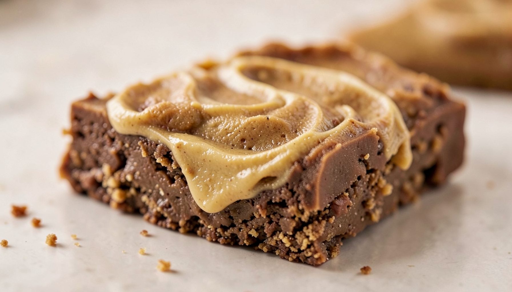
Cookie Butter
Rich, buttery cookie flavor in every bite. Offered in 1-pack and 10-pack options.
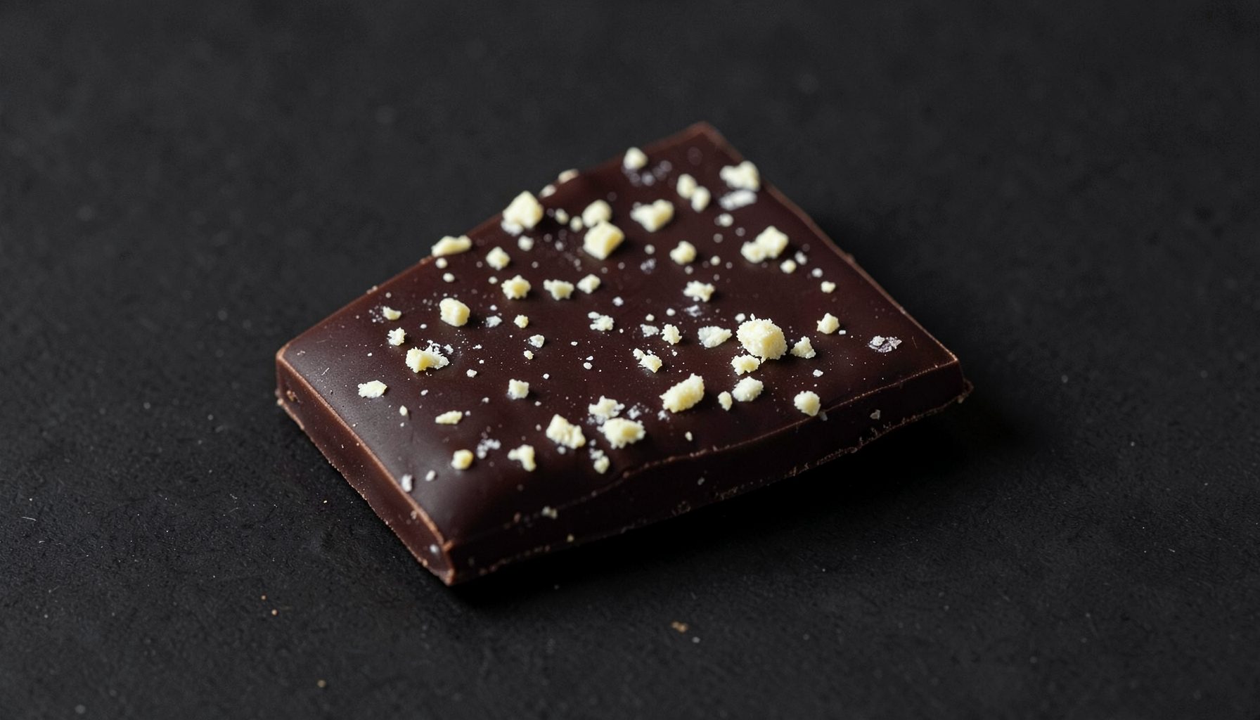
Cookies & Cream
Classic cookies-and-cream taste with a mushroom chocolate twist. 1-pack and 10-pack.
The story behind our signature mushroom cone
Diamond Shruumz is a California-based brand that has built a recognisable collection around mushroom-infused chocolate bars, gummies and cones. With more than 20 flavours and several pack sizes, the range caters to people who want a familiar confection with a less conventional centre. The cone stands apart because its entire shape carries the brand idea.
Our early catalogue centred on bars and gummies, establishing mushrooms as a defining ingredient rather than a passing garnish. As the collection grew, the question became how to express that ingredient in a format with a stronger visual identity. A product needed to remain approachable on a shelf while still signalling that its contents were different.
The history of our signature cone design follows that shift from edible format to brand symbol. It is a history of proportion, packaging and flavour decisions: a familiar silhouette refined to make mushroom-based snacking recognisable, shareable and easy to understand.
From familiar treat to ownable format
Our early products established two useful possibilities. Bars delivered a straightforward chocolate experience, while gummies brought a chewy texture and a playful sense of novelty. Both formats proved that mushrooms could be integrated into everyday treats without losing their identity within the recipe.
The cone offered a different design solution. Borrowing its silhouette from a familiar café treat made the product immediately understandable, while its form provided room for a filling, inclusions and decorative packaging. The result could be held comfortably, divided between friends or recognised from a distance.
That practicality helped the cone become an ownable part of the Diamond Shruumz identity. Its shape connects the physical product with the faceted visual language of the brand, turning something that might otherwise be ordinary confectionery into a distinct object. Later flavour releases have expanded that identity without abandoning the core silhouette.
Flavour became the design partner
With the basic format established, flavour determined how each cone should look, feel and be presented. Fruity profiles, chocolate-forward recipes and bolder combinations require different balances of filling, shell and wrapper. More than 20 flavours give the collection breadth, but consistency keeps the range connected.
Precise naming matters because consumers use flavour descriptions to set expectations. A fruit flavour comparison illustrates why berry mix and blueberry ice suggest different experiences: one implies a blended fruit character, while the other evokes a cooler, more defined fruit profile. That distinction informed our approach to communicating flavour through both taste and design.
Each revision therefore considers aroma, texture and appearance together. A cone that looks chocolatey should deliver chocolate flavours, while a brightly coloured filling should match the flavour named on the pack. The goal is an intuitive relationship between what the customer sees, what they expect and what they taste.
Ingredients set the design boundaries
A distinctive flavour cannot rest on packaging alone. The mushrooms, cocoa, sweeteners and other ingredients establish the character inside the cone, which means sourcing and formulation directly influence its final form. Transparent ingredient information allows customers to understand what distinguishes one recipe from another.
Dosing adds another constraint. The amount of mushroom ingredient in an individual piece and across a pack should be clear, especially when several flavours are available in different sizes. A consistent approach to portioning helps separate an intense sensory experience from a stronger or more concentrated product.
These quality details are easy to overlook because the cone is visually playful, yet they determine whether the experience feels deliberate. The gemstone market provides a useful analogy: a gemstone grading comparison shows how categories can distinguish attractive material from material selected for finer properties. Ingredient identity and precise dosing serve a similar explanatory purpose, making the product’s character visible instead of mysterious.
Adapting the cone for Australian shelves
Bringing a California-developed confectionery into Australia involves more than reproducing the recipe. The product enters a market shaped by supermarket chains such as Coles and Woolworths, independent grocers, convenience stores and online retailers. It competes with imported novelty chocolate and with familiar local confectionery lines, so clarity and portability carry particular weight.
The format suits Australian everyday habits well. A sealed single-serve cone fits naturally into a Melbourne laneway coffee run, a quick stop at a Sydney convenience store or a relaxed catch-up with friends in Brisbane. Its handheld shape also suits people who want a discrete, individually portioned treat without preparing anything at home.
A physical package is only one part of that experience. Digital features can extend the brand’s playful character beyond the shelf, and our WooSpin game guide offers an example of how an interactive element can add participation to a confectionery brand. This creates another layer of recognition without crowding the cone with unnecessary visual elements.
Building responsibility into the format
A responsible design includes clear information about ingredients, allergens, serving quantities and the mushroom content of each product. In Australia, food labelling must comply with the Food Standards Code administered by Food Standards Australia and New Zealand. Those requirements are especially valuable when a product invites experimentation, because customers need reliable details before choosing a flavour or portion.
Australian legislation also draws a firm line around certain claims and ingredients. Novelty confectionery made from legal ingredients can be sold, but a product containing psilocybin cannot simply be presented as an ordinary sweet. The Therapeutic Goods Administration regulates unapproved therapeutic claims, while psychedelic research is confined to authorised clinical and research settings. Our mushroom confectionery is created for legal novelty consumption rather than as a treatment or a guaranteed source of a particular effect.
International differences make careful reading particularly important. An overview of US product regulations helps explain why customers should check their own country’s rules rather than assume that guidance from another market applies. The same caution belongs alongside customer stories about relaxation, wellness or recreational experiences. Individual experiences vary, and an enthusiastic report is not clinical evidence.
Looking back, our cone grew from a practical question about how to present mushrooms in a portable, recognisable treat. Bars and gummies established the ingredient foundation; the cone added a silhouette capable of expressing flavour, personality and the Diamond Shruumz name in a single form.
The detail to remember is that the signature cone works because its playful appearance sits alongside precise formulation. A familiar shape, clearly disclosed ingredients, deliberate dosing and flavour-led design give the product a history grounded in substance rather than novelty alone.

Send Us a Message
Get in Touch
Have questions about our products or your order? Reach out and we'll get back to you.
- California, USA
- Contact Page